
A Little Summary
Team
Shiyu Zhao
UI/UX Design
Skill
Product Thinking
User Research
Market Research
Brainstorming
UI / UX Design
Wireframes
Prototyping
Timeline
Oct ‘25– Nov '25
2 Months
Software
Figma
Zeplin
After Effect
Atlassian
Photoshop
Illustrator
Microsoft Teams
Brief
Empiriecom is a technology service provider that helps large retailers build and operate full e-commerce systems from scratch. Its clients are therefore retailers and brand owners, not end consumers. The UX team I belonged to is responsible for design workflow consulting, accessibility audits, and direct involvement in the UX/UI design and delivery of products, with a strong emphasis on designing based on Behavior Patterns and Usability Heuristics.
As a working student here, I was mainly responsible for platform migrations, UX improvements, and the development of new features, including cutting-edge research on integrating AI concepts into the e-commerce platform.
In what follows, these are two of my key highlight projects.
Drupal Preview
The New Way of Editing
Drupal Preview allows you to edit and verify the website building freely and efficiently, without directly applying it to the working website.
02
01
AI Features
Modernize e-commerce platform
AI features including AI review summary, AI upselling, AI top infos and AI bundles upgrade your online shopping expeirience significantly.
Drupal Preview
Brief
Editors at empiriecom's retail clients were testing content directly on the live system, because the old preview tool couldn't simulate real publishing conditions: one fixed revision, no languages, no audiences,no publish dates.
As the only designer embedded in the CMS team, I redesigned the preview from scratch: user flows, cross-device interaction logic, and the visual system. The design translates competing requirements from the product owner, IT, and the editors into one floating widget with six controls.It passed all stakeholder reviews and has been delivered to development.
Research
Our team identified a critical workflow risk: editors were testing content directly on the live system, rather than in a dedicated preview environment. The root cause was that the existing preview tool was too limited to replicate real publishing conditions. It showed only one fixed revision, with no way to simulate different languages, audiences, or publish dates.
UX/UI Audit
Most comparable features on the market currently adopt a drawer or floating widget design pattern.
Product Owner
The four core filter functions, Test date, Language, Audience, Revisions, must carry equal visual weight. Show All Items and QR Code are to be integrated as key supporting components.
IT-Team
Real-time parameter updates would increase data transmission frequency and compromise system response efficiency. Changes should only take effect on explicit user confirmation.
End Users (editors)
A Reset function is essential to address the pain points of multi-selection configuration scenarios.
A list of problems
that I gathered from PO, IT and End users.
I developed a comprehensive understanding of the Drupal Preview context by reviewing product documents and Jira tickets, collaborating across product, IT, and UX teams, and conducting UX/UI audits of comparable tools on the market. The goal was to define a design strategy that addressed the real pain points of editorial users at retail clients while remaining technically feasible and aligned with business goals.
No contextual content testing
Every change required exiting the preview entirely, navigating the backend, and re-entering. It became a disruptive loop that was being skipped in practice
Revision comparison was impossible
No revision selector meant comparing drafts required manually switching in the edit view and re-entering preview
Mobile preview had no tooling support
Testing on a real device meant copying a URL containing multiple dynamic parameters, and manually transferring it to a phone. There was no integrated handoff path.
Hidden content was invisible during review
Items excluded by audience rules, scheduling logic, or visibility settings were not surfaced in preview. Editors could not perform a full content audit without external workarounds.
The old toolbar couldn't scale with the product
The static blue bar had no room for additional controls, no responsive behavior, and no visual hierarchy. As feature scope grew, patching the old surface became structurally impossible.
The Mission
How might we design a modern preview interface that lets editors validate any content under real publishing conditions without leaving the preview?
Opportunity
The collected pain points illuminate the path of design strategy.
Features
Complete Filter Suite
Integrate all six controls — Audience, Revisions, Language, Testdate, Show All Items, and QR Code — with equal visual weight for the four core filters and supporting status for the auxiliary features.
Visual Form
Floating Widget
Replace the static bar with a freely positionable floating widget, which is a pattern familiar from modern tools. More spatial freedom, less content occlusion, and a contemporary feel aligned with how editorial teams think about contextual tooling.
Interaction
Staged Apply
No change takes effect immediately. Editors configure all parameters, including language, audience, date, revision, then confirm with a single Apply action. This reduces server load and gives editors full control before committing to a preview refresh.
Device
Responsive by Design
Desktop and mobile share the same interaction logic but surface it differently. Mobile upgrades the compact bar to a larger touch-optimized panel with corner-snapping behavior, adapting for thumb reach and lower touch precision.
User Flow
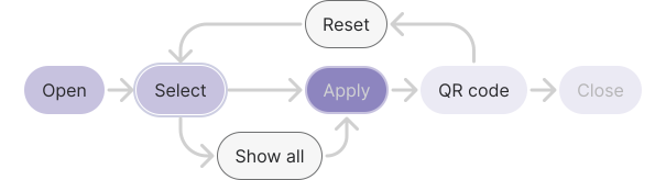
The interaction model follows a clear linear progression from left to right, reflecting the editor's natural decision sequence.
Design Rationale
The bar follows the editor's left-to-right visual reading order. The four core filter controls, including Audience, Revisions, Language, Testdate, sit at equal weight on the left. Show All Items, which is a toggle with different semantic value, is grouped alongside them but visually differentiated. Apply anchors the center as the primary action, with QR Code to its right as a post-confirm output. Reset is positioned last and deprioritized visually, because it's a low-frequency recovery action, not a primary operation.
Design Solutions
Modern
Immersive floating bar
A floating widget bar replaces the rigid fixed header. Minimal, dark-mode-first, and visually unobtrusive. Dark and light modes are both supported, aligned with tenant theme preferences.
On mobile, the compact floating bar upgrades to a larger-area control panel. Touch targets are enlarged, corner positioning replaces free-move, and the layout adapts for thumb-based operation.
Modern
Immersive floating bar
The widget is freely draggable on desktop. When approaching a screen corner, it snaps automatically. On mobile, movement is restricted to corner positions only.
Modern
Immersive floating bar
The full bar can be collapsed to a minimal floating button, minimizing content occlusion during active editing. On mouse-out, all non-essential information hides automatically, reducing visual noise when the editor's focus is on the page content rather than the preview controls.
AI Features
Brief
Empiriecom runs several German e-commerce shops, including Universal, Quelle, Bader, and Otto Austria. As AI matured through 2024 and 2025, the company began looking for AI use cases with real customer value, not just branding.
The same pattern showed up across every category. The shops have plenty of useful data, such as thousands of reviews per product, full spec sheets, product relationships across the catalog, but customers couldn't reach it. Reviews went unread. Specs got buried. Recommendations were based on what people happened to buy together, not what actually fit. The problem wasn't missing information. It was missing structure. I worked on four AI features for the Product Detail Page, each tackling a different side of the same problem.
Design Solutions
Feature 01
AI Review Summary
AI Review Summary reads every review for a product and turns them into one short paragraph. It pulls out the most common strengths and weaknesses, and stays true to the rating distribution: a 4.5-star product reads like a 4.5-star product. Pro and con chips sit below the text. Each chip shows how many times that feedback was mentioned. Tap a chip to filter the reviews behind it.
Feature 02
AI Top Infos
AI Top Infos pulls the two to five most important specs for each product category and shows them as small chips in the Buy Box. For example, resolution and screen size for TVs, capacity and spin speed for washing machines, battery life and noise cancellation for headphones. The product title gets shortened too. The long SEO version stays in the page metadata for search engines, but customers see a clean, readable name instead.
Feature 03
AI Upselling
AI Upselling shows one alternative to the product you're viewing in a small card next to the Buy Box. It picks one product, not twelve, and explains the trade-off in plain language: "This model offers 4K instead of 1080p for €50 more." The card shows the name, key facts, price difference, and rating.
Feature 04
AI Bundle
AI Bundle suggests accessories that actually fit the product you're viewing. Instead of using "customers also bought" data, it looks at the main product's specifications, such as TV size, washing machine RPM, phone model, and finds items rated for those specs. Each suggestion comes with one short line explaining why it fits.